Visual vs. Accessible Help Documentation: Why Not Both?

One of the biggest lessons I’ve learned while designing enterprise experiences is that help documentation is part of the product experience—not an afterthought.
While working on a global B2B platform, I proposed unifying the help documentation across seven different products. At the time, each product maintained its own fragmented help center, making it harder for users to find reliable answers.
Leadership pushed back, citing increased development costs. What they didn’t consider was the long-term trade-off:
- Higher support ticket volume. Fragmented help = frustrated users.
- Slower innovation. Teams spent time answering repetitive issues instead of focusing on real product enhancements.
- Inconsistent user experience. One product had video tutorials, another had only static text, others had outdated FAQs.
The Data Paradox
Ironically, this company called itself data-driven—yet they weren’t tracking support ticket data. That lack of visibility made it nearly impossible to prove the ROI of a unified help system, even though the benefits were clear: fewer tickets, lower costs, and more capacity for strategic work.
Why Consistency Matters
A lone product owner added videos to their help center, which was a great move—but it created inconsistency across the product suite. Users started asking: “Why does this product have better help than the others?”
This inconsistency fostered an unhealthy sense of internal competition between product teams. Instead of aligning toward a unified customer experience, teams began focusing on “who had the better help feature,” which diluted the company’s overall value proposition. Internal product competition might look like innovation, but in reality, it fragments trust, wastes resources, and sends mixed signals to customers.
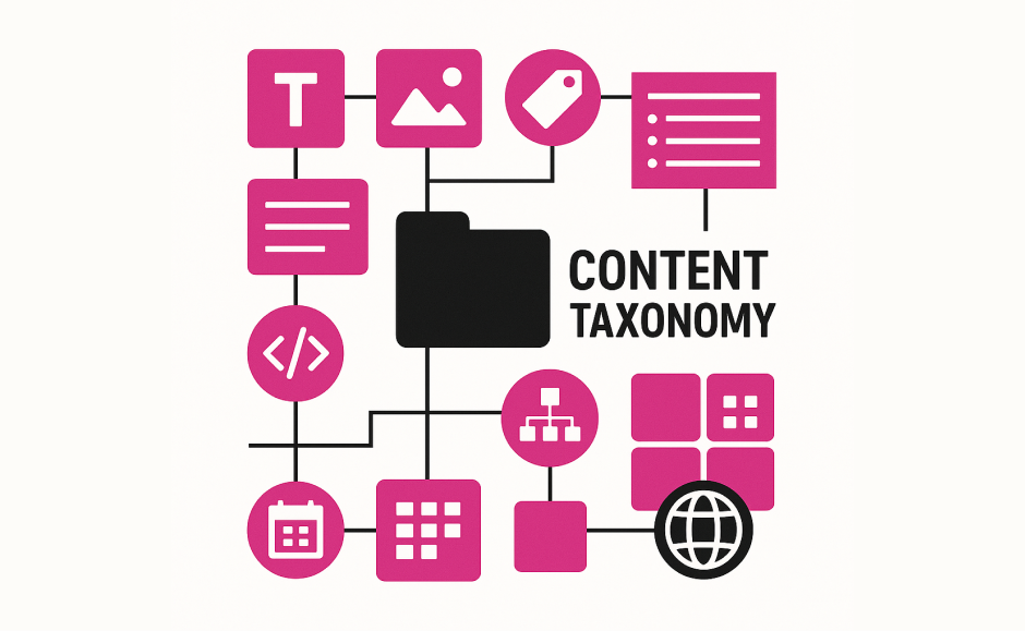
Consistency isn’t just about design. It’s about building trust. That’s where taxonomy and content strategy come in (see my post on Content Re-Labeling & Taxonomy). A unified taxonomy makes documentation coherent, cohesive, and scalable across channels.
Operational Strain
Every time help content changed, the dev team had to update it in four formats:
- Accessible text
- Visual tutorials
- Native iOS
- Native Android
This overhead increased the risk of errors and fragmented information. A unified help system could have reduced duplication, aligned updates, and minimized human error.
Key Takeaway
Help documentation isn’t just about reducing calls to support—it’s about designing a coherent experience that empowers users.
- Accessible formats ensure inclusivity.
- Visual formats improve clarity and engagement.
- Unified systems reduce costs and operational burden.
When you merge accessibility with visual clarity under a unified framework, you don’t just help users—you create a scalable foundation for business growth.
Asvid Balleza
Sr. UX & Product Designer | Founder of Distrito Studio
Designing business transformation through culturally-aware strategy and inclusive digital experiences.
