Why Improving the Interaction of a Single Component Matters

Small Decisions, Big Impacts in UX Design
When designing large digital ecosystems, it’s easy to focus on high-level features or the most visible elements. But often, it’s the smallest interactions — a dropdown, a combo box, a radio group — that either empower users or silently create friction.
In my years designing enterprise tools at Visa, SMB platforms through Distrito Studio, and field services systems for clients across North and Latin America, I’ve seen how improving the interaction of a *single component* can reduce user error, increase adoption, and create ripple effects across the entire experience.
Let’s break this down.
1. Dropdown vs Combobox: Intent vs Flexibility
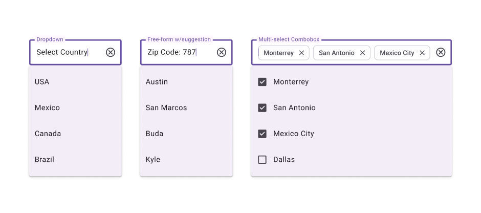
Imagine a form asking for “Country of Operation.”
- A dropdown gives users a fixed list — clear, simple, great when you don’t want mistakes.
- A single-select combobox adds searchability — perfect for long lists, enhancing efficiency.
- A multi-select combobox invites complexity — and often creates confusion if not styled or explained correctly.
Choosing the wrong pattern not only increases time-on-task but may exclude users with assistive technologies. Comboboxes, in particular, need well-structured ARIA roles and keyboard navigation to meet accessibility standards. One poor choice? You’ve just alienated a portion of your audience.
2. Radio Buttons vs Checkboxes: Mutual Exclusivity Matters
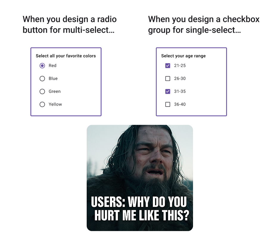
I’ve encountered dozens of audits where the wrong input component confused users. A **radio group** implies a single choice, but if you’re letting users pick multiple options — and you use radios — it becomes a trap.
This isn’t just an aesthetic error. It’s a cognitive one. Users may think they misunderstood the form, blame themselves, or abandon the process. Multiply that confusion by a thousand users a day? That’s not a UI bug — that’s a business loss.
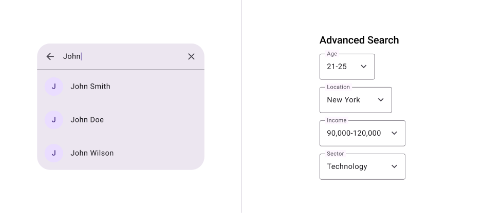
3. Search vs Advanced Search: Know Your User Load
At Visa, we worked on tools serving data-heavy finance and compliance teams. One pattern I saw misused frequently? The classic search bar that did… too little or too much.
- Basic search is perfect when most users look for one keyword.
- But advanced search — with filters, logic, and field-specific targeting — needs to be discoverable, testable, and documented.
Component improvement here isn’t just about labels or visibility; it’s about understanding how different roles (auditors vs analysts vs admins) approach data — and building interaction affordances that support their goals.
4. Data Tables: Nested Filters vs Holistic Filtering
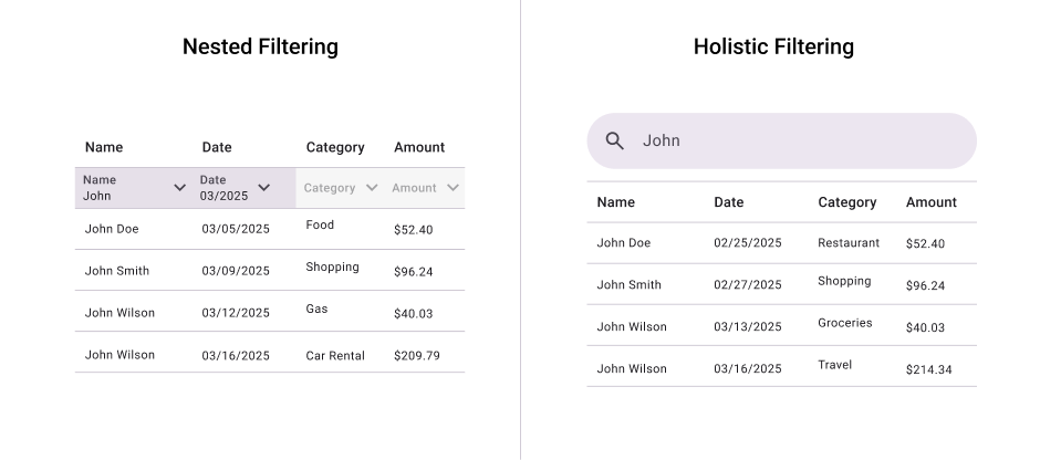
Data tables are another beast. Some teams love nested filters inside column headers — great for quick refinement. Others need holistic filters at the top — cross-cutting across columns, timeframes, and user actions.
If your users are combining conditions (e.g., “transactions over $10k from last quarter in Mexico”), nesting filters just won’t scale. Improving this one interaction model could:
- Reduce support tickets,
- Improve data confidence,
- Help executives make faster, more informed decisions.
That’s not just usability — that’s ROI.
Why It Matters
Improving a single interaction component:
- – Reduces friction — making your app feel faster and more intuitive.
- – Improves accessibility — ensuring assistive tech users aren’t blocked.
- – Boosts adoption — because trust is built on clarity.
- – Reduces support cost — users stop asking, “how does this work?”
At Distrito Studio, we call this micro-interaction strategy. We use it not just to refine interfaces but to build trust — particularly in bi-cultural and bilingual environments where clarity isn’t optional, it’s survival.
Before You Redesign Everything…
Ask yourself:
- Does this component align with the mental model of the user?
- Is the interaction inclusive for different ability levels and cultures?
- Have we tested it in context — not just in isolation?
- Will this scale if we add 10x more data or users?
Because improving a single component isn’t about pixel perfection. It’s about systemic design integrity. It’s about making every touchpoint — no matter how small — a moment of confidence and clarity.
Asvid Balleza
Sr. UX & Product Designer | Founder of Distrito Studio
Designing business transformation through culturally-aware strategy and inclusive digital experiences.


